Ecommerce Heatmap: How to Read One Across Your Whole Store
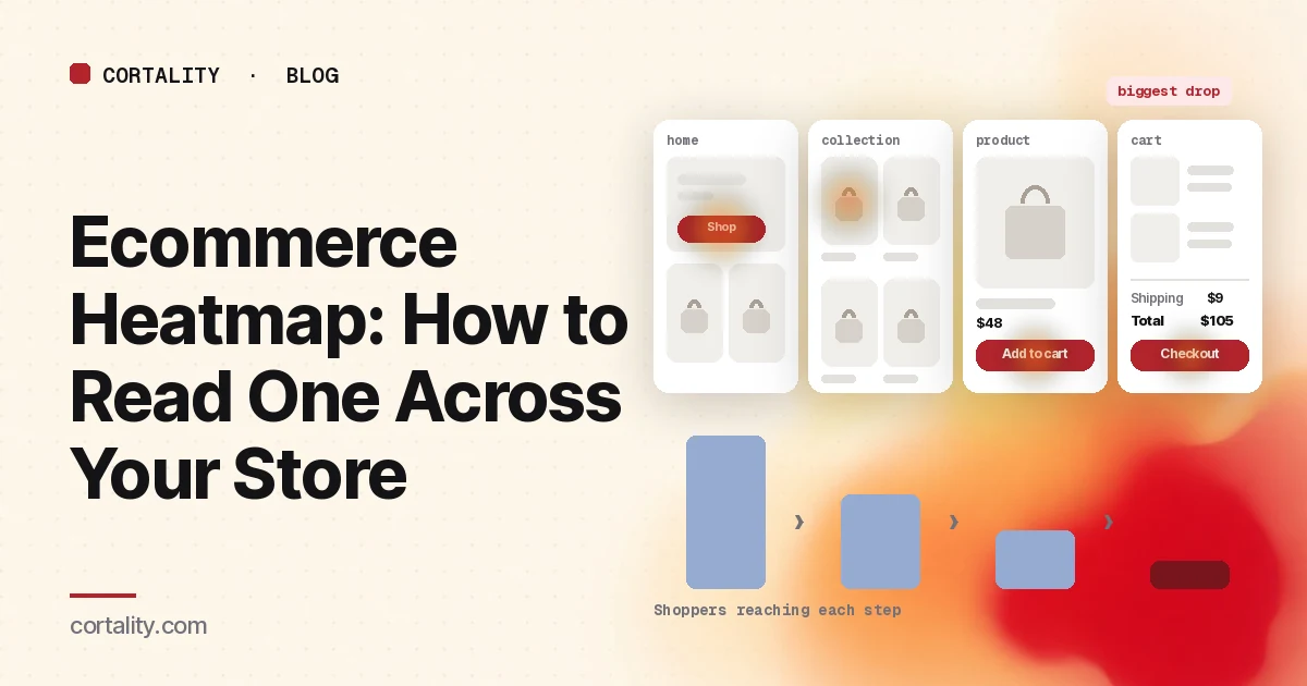
Most stores install a heatmap, open the homepage, look at a lot of red around the menu, and close the tab. The homepage is the easiest map to open and often the least useful one. Shoppers move through your store in steps, from a homepage or ad to a collection, a product, the cart and checkout, and each step loses some of them. An ecommerce heatmap earns its keep when you read it step by step and spend your time on the step that loses the most people.
This guide is the map of the series. It covers which map to open on each page type, what the main signal is at each step, and how to decide where to start. Each step links to a deeper guide: the homepage heatmap, the collection page heatmap, the product page heatmap and the checkout page heatmap. If you're new to heatmaps, how to read a website heatmap covers the basics. Ahead of Black Friday and the rest of the holiday season, work through the holiday ecommerce CRO checklist before the traffic arrives.
What an ecommerce heatmap shows
A heatmap adds up behavior from many visits onto one screenshot of a page. Microsoft Clarity, a free analytics tool from Microsoft, offers five kinds (Microsoft Clarity, Heatmaps overview):
- Click maps show where shoppers click or tap, including on things that aren't links. Clarity can filter them to dead clicks (no response), rage clicks (fast repeated clicks in one spot), error clicks (right before a JavaScript error), first clicks and last clicks (Microsoft Clarity, Click maps).
- Scroll maps show the share of visitors who reach each point of the page, and mark the average fold: how much of the page people see before they start scrolling (Microsoft Clarity, Scroll maps).
- Attention maps show how long visitors spend on each part of the page.
- Area maps total the clicks inside an area you draw, such as a whole product card.
- Conversion maps show, for an area of the page, the share of sessions that ended in a purchase after a click there. Clarity only offers them on projects where it detects purchase events (Microsoft Clarity, Conversion maps).
Some other tools add mouse movement (hover) maps. Treat those as a rough hint on desktop only. There's no mouse on a phone, and on most stores phones bring a large share of the traffic.
Which map to open first
Use the click map to see what shoppers try to do, the scroll map to see what they never reach, and the conversion map, if you have it, to see which clicks come before an order. Read the click and scroll maps together: an element with few clicks only means something if most visitors actually scrolled to it. Our guides to click map analysis and scroll map analysis go deeper on each.
Set it up by page type, not by URL
A store has a handful of templates and hundreds or thousands of URLs. Set up your reading around the templates.
- Group pages that share a template. All product pages share a gallery, a variant picker and a button. All collection pages share a filter, a sort menu and product cards. Clarity lets you add several URL filters to view one heatmap for a group of pages (Microsoft Clarity, Click maps). Read the group to judge the template, then your busiest page of each type on its own to judge its content.
- Split by device. A four-column grid becomes two columns on a phone, menus collapse, and the add to cart button may move. Read desktop and mobile separately; our guide to mobile vs desktop heatmaps explains why the maps differ.
- Split big traffic sources. Shoppers who land on a product from an ad haven't seen your homepage or collections. If ads, email or social send a large share of visitors straight to one page, read that segment on its own.
- Track the steps as events. A heatmap shows behavior on one page. To see how many shoppers move from one step to the next, you need ecommerce events in your analytics. Google Analytics 4's recommended ecommerce events include view_item_list, select_item, view_item, add_to_cart, view_cart, begin_checkout, add_shipping_info, add_payment_info and purchase (Google Analytics, Measure ecommerce). Most store platforms send some of these for you; check which ones arrive.
- Use a fixed window and leave sale days out. Aim for a few hundred page views per device for each page type, and keep the window the same length when you compare before and after a change. A sale changes who visits and why, so read sale days on their own.
Find the step that loses the most shoppers
Before you open any heatmap, write down what share of shoppers move from each step to the next over the same window:
- Visits that reach a collection or search results page
- Collection views that lead to a product view
- Product views that lead to an add to cart
- Carts that lead to a started checkout
- Started checkouts that lead to an order
Some loss at every step is normal. Many visitors are browsing, comparing or saving items for later. Baymard Institute's average of 50 published studies puts the documented cart abandonment rate at about 70%, and in its survey 42% of US online shoppers said they had abandoned a cart because they were just browsing (Baymard Institute, Cart abandonment rate). So don't compare your numbers against a perfect funnel. Compare them against each other and against your own past weeks, and read the heatmap for the step that dropped or that loses the most shoppers. If you see plenty of add to carts but few orders, our guide to add to carts but no sales walks through that case.
Read the store step by step
1. Homepage: do shoppers find a way in?
The homepage's job is to send shoppers to the right products. On its click map, sort the top clicked elements into the menu, search, the hero button, featured collections or products, and things that aren't links. Then check the scroll map: if a featured collection sits far below the average fold on mobile, most phone visitors never see it.
Main signal: where clicks go after the hero, and how many visitors scroll past the first screen. Heavy clicks on search can be a good sign (shoppers know what they want) or a sign the menu doesn't match how they think; the site search heatmap guide shows what happens after they search. The homepage heatmap guide covers both, and Shopify homepage design has the settings checklist.
2. Collection pages: do shoppers open a product?
On collection pages, shoppers decide which product to open, or whether you have what they want at all. Read the unfiltered view first, then filtered views as a separate group, because filtering puts different products in the same positions.
Main signal: product clicks compared with clicks on filters, sort and ways to leave, and dead clicks on swatches, ratings and second images. Product lists are a common weak spot even on big stores: Baymard's product list benchmark of 170+ leading ecommerce sites rated 58% of desktop sites and 78% of mobile sites "mediocre" or worse (Baymard Institute, Product list and filtering). The collection page heatmap guide lists seven patterns and what each usually means.
3. Product pages: do shoppers add to cart?
The product page answers the shopper's last questions: what it looks like, whether it fits, what it costs to get it delivered, and whether other people liked it.
Main signal: clicks on the add to cart button compared with clicks on the gallery, the variant picker, size guides, reviews and shipping details. Lots of clicks on size guides or shipping links are questions that the page didn't answer near the button. Check where the button sits against the average fold on a phone. The product page heatmap guide covers the patterns, and the Shopify product page audit has a 12-point checklist.
4. Cart and checkout: do buyers pay?
Here heatmaps see the least. Hosted checkouts run on your payment provider's domain, Shopify loads custom pixels in a sandbox, and card fields usually sit inside a third-party iframe. Read the cart page with a heatmap and track the checkout steps as events.
Main signal: dead clicks on the shipping line or total, clicks on the discount code field from buyers who then leave, and last clicks right after costs appear. Costs matter more than anything else here: among shoppers who weren't just browsing, 40% in Baymard's survey said they had abandoned because extra costs (shipping, tax, fees) were too high (Baymard Institute, Cart abandonment rate). The cart page heatmap guide covers the review step: quantities, shipping estimates and the checkout button. The checkout page heatmap guide covers what you can and can't record once payment starts, and Shopify checkout optimization has the settings.
Mobile and desktop are different stores
On most stores, the same template behaves differently on each device. The menu becomes a hamburger, filters move behind a button, the add to cart button can fall below a tall gallery, and the order summary at checkout collapses behind a link. Read every step on both devices before you decide where the biggest loss is. A step that looks healthy on desktop can be the worst step on mobile, and if mobile brings most of your traffic, that's the one to fix. If your mobile numbers trail desktop across the board, start with why mobile conversion rates are low.
How much traffic you need
Clarity notes there's no minimum traffic needed to generate a heatmap (Microsoft Clarity, Heatmaps overview). That's true of drawing the map, not of reading it. A map from a few dozen visits mostly shows what those few people did.
A few hundred page views per device for each page type you read is a sensible minimum. Product and collection templates usually get there first because grouping adds up every product and every collection. Cart and checkout get the least traffic, so they need the longest window. If your store is small, group by template, use a longer window, and watch a few session recordings to check that the pattern is real. Our guide to heatmaps on a low-traffic website covers what you can still read.
Common misreads on store heatmaps
- Starting with the homepage because it's busiest. The busiest page isn't always where shoppers are lost. Start with the step that loses the most.
- Reading one product and judging the template. One product's photos and price can make the layout look better or worse than it is. Judge the layout on the group.
- Mixing filtered and unfiltered collection views. The same grid position holds different products, so heat on a card means little.
- Reading a blank checkout area as unused. Payment iframes and hosted checkouts don't show up. Check orders by payment method instead.
- Counting clicks as success. A click on add to cart isn't an order. Judge changes by the share of shoppers who reach the next step, and in the end by orders.
- Reading sale weeks as normal weeks. Discounts change who visits and how fast they decide.
Turn one pattern into one change
Pick the step that loses the most shoppers, find the single pattern on that page that affects the most of them, and write it down as a hypothesis with a number you can re-check. For example (illustrative): "On mobile, product views lead to an add to cart less often than on desktop, the size guide is the most clicked element after the gallery, and the add to cart button sits below the average fold. Move the size chart link and a one-line fit note directly above the button, and compare product-to-cart rate on mobile over two equal weeks."
Our CRO hypothesis template gives you a format for writing these down. Most stores don't have enough traffic on one page for a fast A/B test; CRO without A/B testing shows how to measure a before-and-after honestly. When you're choosing between several fixes across the store, the CRO prioritization framework helps you rank them.
Ecommerce heatmap checklist (copy this)
- Ecommerce events checked in analytics (product views, add to cart, checkout started, purchase)
- Share of shoppers moving between each step written down for one fixed window
- Step that loses the most shoppers picked, on each device
- Pages grouped by template (homepage, collections, products, cart)
- Busiest or ad-linked page of each type read on its own
- Desktop and mobile read separately
- Large traffic sources (ads, email, social) read on their own
- A few hundred page views per device for each page type, no sale days inside the window
- Click and scroll maps read together for the chosen step
- Unfiltered and filtered collection views read separately
- Checkout read with events where the heatmap can't run
- One change shipped, re-measured over the same window length
Where Cortality fits
Most of this comes down to one question: what do shoppers actually see, skip and tap at each step of your store, and where do they stop? Cortality measures how real visitors use every part of your pages, including the menu, the product cards, the add to cart button and the cart, on each device. You get a ranked list of fixes, each with the evidence and the exact change to make, and after you ship a fix Cortality re-measures it and tells you whether it worked. It works alongside Google Analytics and Microsoft Clarity rather than replacing them. See how it works or what a finding looks like. For stores, see Cortality for Shopify stores.
For a quick first look, our free page leak scan takes about a minute and needs no install. It's a prediction from our attention model, not data from your real visitors, so use it to decide where to look first.
Plans are $99, $249 or $499 a month (Starter, Growth and Scale). Start your free week, and you see your first report before you pay. You save a card at signup, and nothing is charged until 3 days after your first report. Cancel before then and you pay nothing, and any charge can be refunded within 14 days. How the free week works.
Questions
What is an ecommerce heatmap?
A picture of where shoppers click or tap, how far they scroll and, in some tools, where they spend time on a store's pages, added up across many visits. On a store it's most useful read by page type (homepage, collection, product, cart and checkout), because each step has a different job and a different thing to look for.
Which page of my store should I read first?
The step that loses the most shoppers. Use your analytics to see what share of visitors move from collection to product, product to cart, and cart to checkout, then read the heatmap for the step with the biggest drop. That's usually more useful than starting with the homepage because it gets the most traffic.
Do I need a separate heatmap for every product?
No. Product pages share one template, so group them to judge the layout: the gallery, the variant picker, the add to cart button and the details below. Read your best-selling product, or the one your ads point to, on its own to judge that product's photos, price and copy.
How much traffic does an ecommerce heatmap need?
A few hundred page views per device for each page type you read is a sensible minimum. Tools like Microsoft Clarity will draw a map from any amount of traffic, but a map from a few dozen visits mostly shows those few visitors. Group pages that share a template, and back up what you see with a few session recordings.