Gift Card Page Heatmap: What Last-Minute Holiday Buyers Need to See
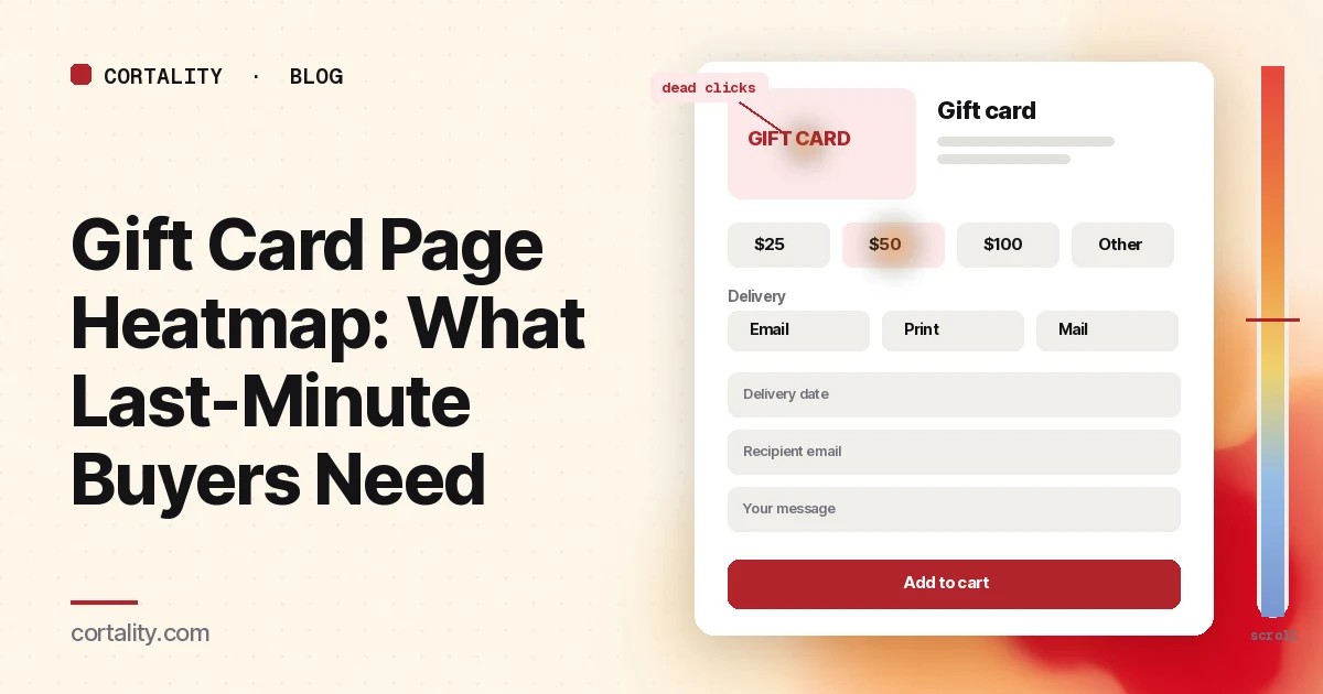
For most of the year, the gift card page is a quiet product page that nobody on the team looks at. Late in the holiday season it changes job. Once your last shipping cutoff has passed, a gift card is often the only thing you can still sell to someone who needs a present by a certain day. The shoppers who land on it are short on time, often on a phone, and buying for someone else.
Gift cards are also what a lot of people want. In the National Retail Federation's holiday survey this year, 47% of holiday shoppers said they would like to receive gift cards, the top answer, ahead of clothing at 44% (NRF, Affordability Shapes Winter Holiday Shopping, Oct. 20, 2026). And most of the season's online shopping happens on phones: Adobe forecasts that mobile will account for 57.4% of U.S. holiday online spending this season (Adobe, 2026 holiday forecast, Sept. 28, 2026).
This guide is about reading a heatmap of that page: what to set up, what to look at first, what the common patterns usually mean, and which change to make first. It's part of our page-type series. For when to switch your messaging to gift cards, see holiday shipping cutoff dates. For the gift guide that can send shoppers here, see the gift guide page heatmap. For the rest of the store in the holiday window, use the holiday ecommerce CRO checklist. If you're new to heatmaps, how to read a website heatmap covers the basics first.
Why the gift card page needs its own read
A gift card page is short, but it asks the shopper to make more decisions than most product pages do, and to make them for someone else. Four questions decide whether they buy:
- How much? Preset amounts, a custom amount, or both. Shoppers often want a round number that matches what they would have spent on a physical gift.
- How and when does it arrive? By email, as a printable card, or as a physical card in the post. For a late shopper, the delivery date is the whole point: can it arrive on the day, or be scheduled for the morning of the holiday?
- To whom, and with what message? Recipient name and email, sender name, a short message. On a phone, these fields can push the buy button far down the page.
- What can they spend it on? Online only, in store too, or both. Any expiry or exclusions. A buyer wants to know the recipient won't be stuck.
If any of those answers is missing or hard to find, the shopper either leaves or goes looking for it, and both show up on a heatmap. So read the page for the job it has in the season: let a hurried buyer choose, set the delivery and pay in about a minute.
What a gift card page heatmap shows
A heatmap adds up clicks and scrolls from many visits onto one screenshot of the page. Microsoft Clarity, a free analytics tool, will draw one from any amount of traffic, for a single page or a group of pages (Microsoft Clarity, Heatmaps overview).
The click map ranks elements by clicks, including things that aren't links, and lets you switch to dead clicks, rage clicks, error clicks, first clicks and last clicks. From any element you can open the session recordings behind it (Microsoft Clarity, Click maps). On a gift card page, that tells you which amounts people pick, which delivery options they open, and where their last click lands before they leave.
The scroll map shows how far down the page people get, in 5% steps, with a drop-off view and the average fold (Microsoft Clarity, Scroll maps). On a phone, the recipient fields and the buy button often sit well below the first screen.
The compare view puts two heatmaps side by side, for example mobile against desktop, or the page before and after you moved the delivery date up (Microsoft Clarity, Heatmaps compare).
Set it up so the map means something
- Split by device. Read mobile and desktop separately. Amount buttons, date pickers and form fields behave very differently on a phone. Our guide to mobile vs desktop heatmaps explains why the maps differ.
- Know where people come from. Note every way in: the menu, the footer, a gift guide tile, a sitewide banner after your shipping cutoff, an email. A shopper who arrives from an "it won't arrive in time, send a gift card" banner has a different question in mind from one who came from the footer. If your analytics can filter by previous page or by campaign, read the late-season group on its own.
- Know the page's states. Choosing "email" versus "physical card" often shows or hides fields. A date picker opens over the page. A custom-amount box may appear only after a click. Clarity notes that the page impression shown on a click map might not show the element a user actually clicked. Write down which state you're looking at, and open recordings when the screenshot and the ranking disagree.
- Write down the one action. On a gift card page it's adding the card to the cart, or buying it directly. Judge the map against that.
- Track the steps in analytics. Google Analytics 4's ecommerce events include add_to_cart, view_cart and begin_checkout (Google Analytics, Measure ecommerce). If the gift card is set up as a product, compare its add-to-cart rate with the rate at which those carts reach checkout. A gift card that is added but not bought often points to a problem after the page, such as a surprise in checkout.
- Use a fixed window. Aim for a few hundred page views per device, and keep the window the same length when you compare before and after a change. Most gift card traffic arrives in a short burst late in the season, so set the map up now. If your page is quiet, heatmaps on a low-traffic website covers what you can still learn. Before you have data, our free page leak scan predicts where attention will land. It's a prediction, not your visitors' behavior, but it shows where to look first.
Read the first screen first
Expect most attention near the top. In Nielsen Norman Group's eyetracking research, people spent about 57% of their page-viewing time above the fold, about 74% in the first two screenfuls, and 81% in the first three (Nielsen Norman Group, Scrolling and Attention). On a gift card page, the first screen should answer two questions: how much, and how it arrives.
Check that the amounts are on the first screen. If a large card image fills the first screen on a phone, the amount buttons may sit below the average fold. A low share of visitors reaching them means many never started choosing.
Check that the delivery method is visible next to the amounts. "Email gift card" and "physical gift card" are different products for a late shopper. If the page doesn't say which one it is, or hides the choice below the description, shoppers have to guess whether it can still arrive in time.
Check for a one-line delivery promise. Something like "Delivered by email, instantly or on the date you choose" answers the late shopper's main question in one sentence. Only say it if it's true for your setup; if a physical card is the only option, say when the last order date is for it to arrive.
Then read the clicks
Clicks spread across every amount are normal. Clicks bunched on one amount, followed by exits, are worth a look: watch a few recordings. The amount may be the default and people are leaving for another reason, or they may be looking for a value you don't offer.
Clicks on a custom amount box that lead to errors or rage clicks usually mean the box has limits the page doesn't state, such as a minimum or maximum, or it rejects the format people type ("$75" versus "75"). State the limits next to the box, and accept the common formats.
Dead clicks on the card image are common. Shoppers expect it to open a larger view, or to let them pick a design. If you offer designs, make them clearly selectable. If you don't, make sure the image doesn't look like a choice.
Clicks on the delivery date field that end in exits often point to a date picker that's hard to use on a phone, or one that doesn't allow the date they wanted. Watch the recordings. If people try to pick the holiday itself and can't, the page needs to say why, or the setting needs to change.
First clicks on the menu, logo or search from shoppers who arrived from a "too late to ship" banner mean the page didn't answer them quickly. Check what they search for next. The site search heatmap guide covers how to read those queries; a search for "e-gift" or "email gift card" is a strong hint that the page doesn't make the delivery method clear.
Clicks on "Where can I use this?" or a terms link show shoppers checking whether the recipient can spend it in store, online or both. If many of those visits end there, put the answer on the page in one line instead of behind a link.
Then read the form and the buy button
The recipient and message fields are the part of a gift card page most likely to cost you sales on a phone.
Check how many fields there are. Recipient name, recipient email, confirm email, sender name, message, delivery date. Each one is reasonable; together they can fill two phone screens. Nielsen Norman Group's guidelines for web forms recommend keeping forms short and removing unnecessary fields (Nielsen Norman Group, Website Forms Usability). Ask whether each field is needed for the card to be delivered, and mark the optional ones clearly.
Look for drop-off between the fields and the button. In recordings, watch where people stop. A shopper who fills in the recipient's email and then leaves may have hit an error, or may not have found the button below the keyboard. For field-by-field drop-off, our form abandonment analysis guide covers how to measure it.
Check that the buy button is on screen after the last field. On a phone, the keyboard and a long message box can hide it. A sticky button, or a shorter form, often helps more than a new color.
Read the cart from the other side. On the cart page heatmap, check whether gift card orders show different last clicks from other orders, for example on shipping options that don't apply to an email card. Extra costs and surprises matter here too: in Baymard's research, setting aside shoppers who were just browsing, 40% had abandoned an order because extra costs were too high and 12% because they couldn't see or calculate the total up front (Baymard Institute, Cart abandonment rate, updated Oct. 28, 2026). If an email gift card shows a shipping line at checkout, explain it or remove it.
Then read the scroll map
After the click ranking, spend a minute with the mobile scroll map.
Note the average fold and the share of visitors who reach the amounts, the delivery choice, the recipient fields, the buy button and the terms. On a short page you'd expect most visitors to reach the button. If a large share stop before it, look at what's in between: a long description, a large image gallery, or a block of terms that looks like the end of the page.
Watch for false floors: a full-width banner, a reviews block or a strong color change that makes the page look finished. Nielsen Norman Group's research on scrolling warns that a page that looks complete can stop people from scrolling. On a gift card page, the fix is usually to move the form up rather than to hope people scroll.
Common mistakes reading a gift card page heatmap
Reading it against your other product pages. A gift card page is supposed to be short and decisive. A low scroll depth can be good if most visitors click the buy button. Judge it against its own action.
Reading a quiet window. A map from October tells you little about how the page works in the last week before the holiday, when the visitors are in a hurry and arrive from your cutoff messaging. Read the late-season window on its own.
Fixing the page when the problem is the path. If few visitors reach the page at all, the issue may be that shoppers who miss your shipping cutoff never see a link to it. Check your product pages, cart and banners after the cutoff, as the holiday shipping cutoff dates guide describes.
Changing everything at once. If you shorten the form, move the amounts and add a delivery line in one go, you won't know which change helped.
Turn one pattern into one change
Pick one pattern, write down what you think it means, make one change, and re-measure over a window of the same length. For example: "On mobile, shoppers who reach the gift card page from the after-cutoff banner rarely reach the delivery date field, which sits below the description, and most of them leave. If we put 'Delivered by email on the date you choose' next to the amounts and move the date field up, the share of those shoppers who add a gift card should rise over the next three days."
Our CRO hypothesis template gives you a format for writing these down. With holiday traffic changing day to day, a clean A/B test is often out of reach, so CRO without A/B testing shows how to measure a before-and-after honestly. If you'd rather not run that re-measurement by hand, every Cortality plan re-measures each fix you ship; compare the plans.
Gift card page heatmap checklist (copy this)
- Desktop and mobile read separately
- Every way in listed, including the after-cutoff banner and gift guide
- Page states noted: email vs physical, custom amount, date picker
- One action written down (add to cart or buy)
- Amounts and delivery method on the first screen on a phone
- One true line on how and when the card arrives
- Custom amount limits stated next to the box
- Dead clicks on the card image and terms links listed and fixed
- Delivery date picker tested on a phone, including the holiday itself
- Recipient and message fields cut to what delivery needs, optional ones marked
- Buy button visible after the last field with the keyboard open
- Where the card can be spent stated in one line
- No shipping line or surprise cost on an email card at checkout
- One change shipped, re-measured over the same window length
Where Cortality fits
Most of this comes down to one question: what do late holiday shoppers actually see, skip and tap on your gift card page, and do they buy or leave? Cortality measures how real visitors use every part of your page, including the amount picker, the delivery options and the recipient fields, on each device. You get a ranked list of fixes, each with the evidence and the exact change to make, and after you ship a fix Cortality re-measures it and tells you whether it worked. It works alongside Google Analytics and Microsoft Clarity rather than replacing them. See how it works or what a finding looks like. For online stores, see Cortality for Shopify stores.
For a quick first look, our free page leak scan takes about a minute and needs no install. It's a prediction from our attention model, not data from your real visitors, so use it to decide where to look first.
Plans are $99, $249 or $499 a month (Starter, Growth and Scale). Start your free week, and you see your first report before you pay. You save a card at signup, and nothing is charged until 3 days after your first report. Cancel before then and you pay nothing, and any charge can be refunded within 14 days. How the free week works.
Questions
What does a gift card page heatmap show?
Where visitors click or tap on your gift card page, how far they scroll, and which elements they click that don't respond. On a gift card page that usually means which amounts people pick, whether they find the email or physical delivery choice and the delivery date, whether they reach the recipient and message fields on a phone, and whether they click the buy button or leave.
Why does the gift card page matter more late in the holiday season?
Because it's the one gift that still works after your last shipping cutoff. A digital gift card can be delivered by email right up to the last minute, so late shoppers who can't get a physical item in time often end up on that page. They are in a hurry, often on a phone, and buying for someone else, so any confusion about delivery or amounts costs more than usual.
Should a gift card page look like a normal product page?
It can use the same template, but the questions are different. A shopper doesn't need sizes, reviews or a returns policy for a gift card. They need to choose an amount, choose how and when it is delivered, enter the recipient and a message, and know what the recipient can spend it on. Read the heatmap for whether those four things are easy to find, not for how the page compares with your other products.
How much traffic does a gift card page heatmap need?
A few hundred page views per device in the window you're reading is a sensible minimum. Microsoft Clarity will draw a heatmap from any amount of traffic, but a map from a few dozen visits mostly shows those few people. Gift card traffic is often concentrated in the last days before the holiday, so set up the map early and read it as the visits come in, alongside session recordings.
Where does Cortality fit on a gift card page?
Cortality measures how real visitors use each part of your page, including the amount picker, the delivery options and the recipient fields, on each device. It ranks what to fix, and re-measures each change you ship. It works alongside Google Analytics and Microsoft Clarity rather than replacing them. Before the page has traffic, the free page leak scan at /leak/ is a prediction from our attention model, not data from your real visitors.