CTA Button Placement: Where It Should Sit, and How to Prove It
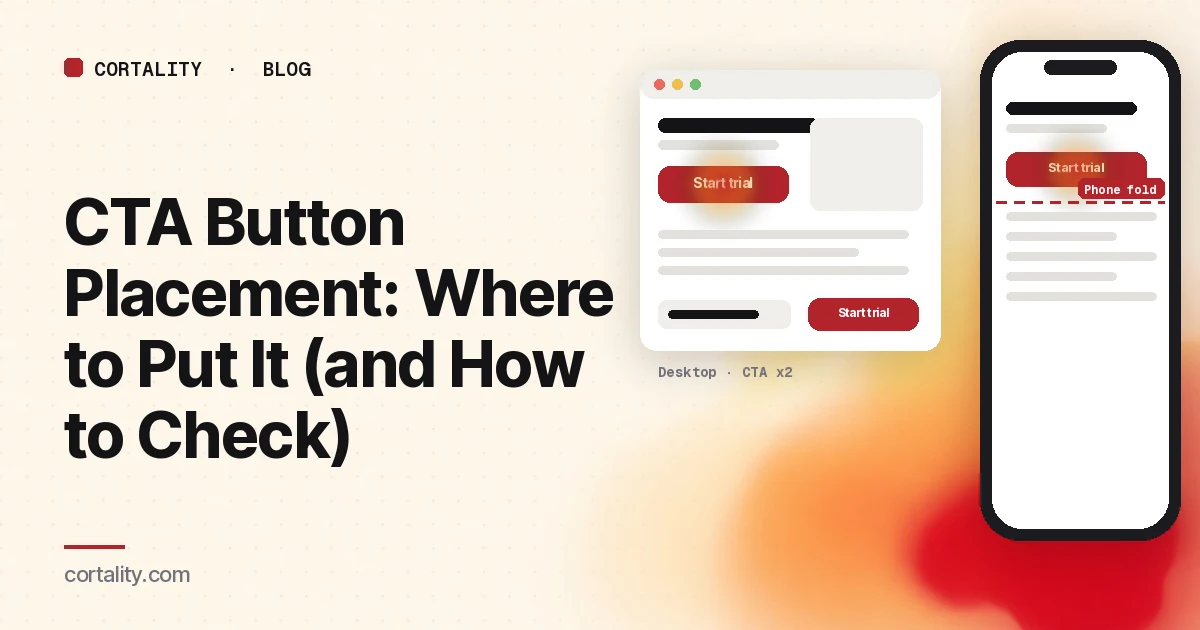
A call to action in the wrong place looks like a conversion problem. Visitors who would have clicked never see the button. Visitors who do see it have already decided to leave. Redesigning the whole page rarely fixes that. Placement does, once you stop guessing and measure where people actually look and stop.
This guide covers where a CTA belongs on a landing page, how desktop and phone differ, the patterns that show up in heatmaps, and a short method for checking your own page.
What "good placement" means
Good placement is not a pixel number. It is three things at once:
- Reach. Enough of the right visitors see the button.
- Clarity. When they see it, they know it is the main next step.
- Timing. It appears when they have enough reason to click, not only when the designer had space.
A button at the top of a confusing page fails on timing. A crystal-clear button three screens down fails on reach. You need both.
The placement rules that hold up
1. Put the first CTA where most visitors can see it without scrolling
Nielsen Norman Group's eyetracking work keeps finding the same pattern: attention concentrates near the top of the page. In their 2018 analysis, users spent about 57% of page-viewing time above the fold, and about 74% in the first two screenfuls (NN/g, Scrolling and Attention). An earlier fold analysis put the average difference in how users treat information above vs below the fold around 84% (NN/g, The Fold Manifesto). People do scroll, but only when the first screen gives them a reason.
So the first instance of your main button should usually sit in that first screen on the device that brings most of your traffic. Our guide to what to put above the fold covers the rest of that screen.
2. Repeat the CTA after the content that answers objections
On a short page, one button can be enough. On a longer page, visitors who scroll past the hero still need a clear next step after pricing, proof or how-it-works. Repeat the same primary action there. Don't invent a second, equally loud offer.
3. One primary style; quieter secondary actions
Two equally styled buttons side by side split attention. Make one the main path. If you need a secondary option ("See pricing", "Talk to sales"), make it a text link or a quieter style. Our guide to signup buttons versus inline forms covers which first ask fits which offer.
4. Put proof next to the ask, not only at the bottom
A review three screens below the button helps the people who already scrolled, not the people deciding at the button. One specific, checkable piece of proof near the CTA is usually worth more than a logo wall at the footer. See trust signals before your first CTA.
5. Label the button with what happens next
Placement can't save "Submit" or "Learn more" when the visitor needs to know the outcome. "Get my quote", "Start free trial" and "Book a 15-minute demo" tell them what they're starting. Only promise what's true.
Desktop vs mobile: the same page, different placement
A responsive layout often moves the button even when you didn't intend to. A hero image, headline and paragraph that leave the button visible on desktop can push it below the phone fold. Side-by-side cards that sit beside the CTA on desktop stack above it on mobile.
Treat the devices as two placements:
- Check your analytics for the traffic split.
- Read the mobile scroll map for where the average fold sits and what share of phone visitors reach the button.
- Read the desktop map the same way.
- Fix the device that is worse first, usually with a mobile-only restack or a shorter hero, not a desktop redesign.
Our guide to mobile vs desktop heatmaps covers the side-by-side method.
What heatmaps show about CTA placement
The button below where most visitors stop
The scroll map shows a steep drop before the CTA. Reach is the problem. Move the button up, shorten what sits above it, or repeat it higher. This is the most common mobile finding.
Visitors reach the button and don't click
Reach is fine; the click map shows a cold primary CTA. Look at the button itself: contrast, label, competing nav or chat widgets, missing proof, or a surprise next to the ask ("We'll call you today" with no warning). Placement alone won't fix this. Our guide to reading a click map covers the "saw it, didn't click" pattern. Nielsen Norman Group found that weak clickability cues, such as ghost buttons or links styled like plain text, made people slower and less sure about what to click (NN/g, Flat UI Elements Attract Less Attention and Cause Uncertainty).
Heat on things that look like the CTA but aren't
Plan names, bold headings, product photos and outlined cards attract clicks when they look tappable. Visitors try those instead of the real button. Either make the hot element do what they expect, or make it look less like a control and strengthen the real CTA.
Sticky bars and banners covering the button on phones
A cookie banner, app install prompt or chat bubble can sit on top of the CTA on a real phone. Check the page with those showing. A heatmap of the page underneath won't show a finger that couldn't reach the button.
A method to check your own CTA placement
- Pick one URL and one date range with no major page changes in the middle.
- Write down where the main CTA sits on desktop and on a real phone (above the fold, after which section).
- Read the scroll map first. Note the share of visitors who reach the button on each device.
- Read the click map second. Note the button's share of clicks, and anything hotter than it on a landing page.
- Watch five to ten recordings of visitors who reached the button and left without clicking, and of visitors who clicked something else nearby.
- Write one line before you change anything: what you saw, the likely cause, the change, and the metric you'll compare. Our CRO hypothesis template gives you the fill-in format.
Example (illustrative numbers): "On mobile, 34% of visitors reach Start trial against 81% on desktop. Shorten the hero on mobile so the button sits above the phone fold. Compare mobile clicks on Start trial, two weeks before and after."
Mistakes that waste a good button
- A tall hero that looks finished. Full-screen images and videos can hide that the page continues, so visitors never scroll to a lower CTA.
- Equal CTAs for different offers. "Start trial" and "Book demo" in the same style force a choice before the visitor is ready.
- Judging placement from a desktop design file. The fold moves with every device. Measure, don't assume.
- Moving the button without checking reach. If people already see it and don't click, move proof and clarity, not just the pixel position.
- Hiding the outcome. A perfectly placed button that surprises people on the next screen creates landing page friction instead of conversions.
Where Cortality fits
CTA placement problems show up as elements people never reach, or reach and ignore. Cortality measures how real visitors use every part of your page, including what they see, skip, tap and stop at, on each device. You get a ranked list of fixes, each with the evidence and the exact change to make, and after you ship a fix Cortality re-measures it and tells you whether it worked. It works alongside Google Analytics and Microsoft Clarity rather than replacing them. See how it works or what a finding looks like.
For a quick first look, our free page leak scan takes about a minute and needs no install. It's a prediction from our attention model, not data from your real visitors, so use it to decide where to look first.
Plans are $99, $249 or $499 a month (Starter, Growth and Scale). Start your free week, and you see your first report before you pay. You save a card at signup, and nothing is charged until 3 days after your first report. Cancel before then and you pay nothing, and any charge can be refunded within 14 days. How the free week works.
Questions
Where should a CTA button be placed on a landing page?
Put the main call to action where visitors can see it without scrolling on the device that brings most of your traffic, then repeat it after the sections that answer the main objections. One primary button style. Secondary actions should look quieter.
Should the call to action always be above the fold?
The first instance should usually be visible on load, because that area gets most of the viewing time. Long pages can also place CTAs lower, after proof or pricing, for visitors who need more before they click. Don't rely on a single button buried under a tall hero.
How do I know if my CTA placement is wrong?
Compare reach and clicks. If the scroll map shows few visitors reach the button, move it up. If most visitors reach it and few click it, the problem is the button itself, the label, competing elements or missing proof, not its vertical position.
Is CTA placement different on mobile?
Often yes. The same hero that leaves the button visible on desktop can push it below the phone fold. Check the mobile scroll map separately, and shorten or restack what sits above the button on phones.