What to Put Above the Fold on a Landing Page: 7 Things the First Screen Has to Do
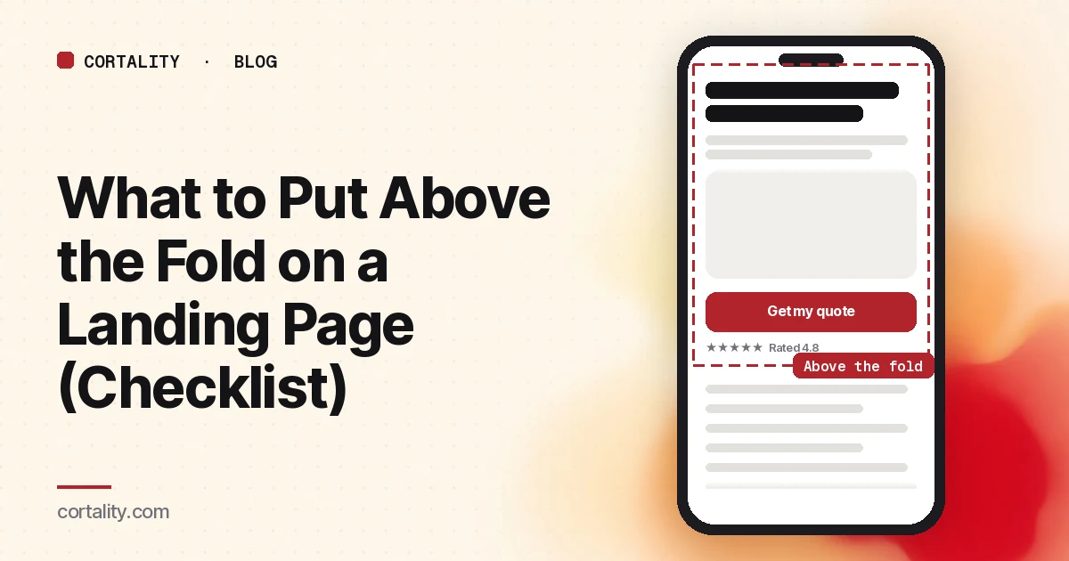
"Above the fold" is the part of your landing page a visitor sees before scrolling. The term comes from newspapers, and some people say it's dead because everyone scrolls now. The research says otherwise: people scroll, but only when the first screen gives them a reason to, and that screen still gets the most attention by a wide margin.
This guide covers what the evidence says about the fold, the seven jobs your first screen has to do, what can safely wait further down, the mistakes that hide your offer, and how to check what your visitors actually see.
Does the fold still matter?
Yes, though less than it used to. Nielsen Norman Group compared eyetracking studies from 2010 and 2018. In 2010, 80% of viewing time went to content above the fold. In 2018, it was about 57%, and 74% of viewing time went to the first two screenfuls (NN/g). The second screen got roughly a third as much attention as the first. That study used desktop screens, so the exact numbers won't carry over to phones, but the pattern does: attention bunches at the top.
In a separate analysis of more than 57,000 eye fixations, the 100 pixels just above the fold were viewed 102% more than the 100 pixels just below it (NN/g). The same article's summary of why: content above the fold has a low interaction cost, while anything below it requires the visitor to guess that there's more and decide it's worth scrolling.
So the first screen has two jobs: convince the ready visitor to act, and convince everyone else that scrolling is worth it.
There is no single fold
The fold sits in a different place on every device, and on phones it moves when the browser's address bar shows or hides. A responsive page has several folds, one per screen size (NN/g). In practice, check two:
- The most common phone your visitors use, in portrait, with the cookie banner, chat bubble and any sticky bar showing. This is usually where the first screen is smallest and most crowded.
- A typical laptop screen, not your large desktop monitor.
Your analytics tool will tell you the device mix. If most of your paid traffic is mobile, the phone fold is the one that matters.
The 7 jobs of the first screen
1. Say what it is and who it's for
The headline should name the offer in the visitor's words. "Bookkeeping for Shopify stores, done monthly" beats "Financial clarity, reimagined." If a visitor can't tell what you sell from the headline, nothing else on the screen can save it.
If the visitor came from an ad or an email, the headline should match the promise they clicked. A mismatch makes people think they landed on the wrong page.
2. Say why it's worth it
One supporting line under the headline: the main outcome, or what makes you different from the obvious alternative. Keep it to one or two short sentences. On mobile, a three-line subheadline can push the button below the fold on its own.
3. Show the main call to action
Nielsen Norman Group's guidance from the same eyetracking work is to keep major calls to action above the fold (NN/g). Make the button say what happens next ("Get my quote", "Start free trial", "Book a 15-minute demo"), not "Submit" or "Learn more", and make it look like the main thing on the screen.
One main action. Two equally styled buttons side by side split the decision. If you need a secondary option, make it a text link. Our guide to signup buttons versus inline forms covers which first ask fits which offer.
4. Give one reason to believe you
Not a wall of logos. One specific, checkable piece of proof near the button: a rating with the number of reviews, a recognizable customer, a short quote with a name. Proof that sits three screens down doesn't help the visitor deciding right now. Our trust signals before your first CTA guide covers which signals are worth the space on a phone.
5. Show the thing, not a mood
The visual should show the product, the result, or the product in use: a screenshot, the item itself, a before and after. Generic stock imagery takes up the most valuable space on the page and tells the visitor nothing about what they'd get.
Watch the size. A hero image or video that fills the whole first screen pushes the headline and button out of view on phones.
6. Answer the deal-breaker question, if there is one
Some offers have one question that stops people cold: price, delivery area, "do I need a card?", "is this for businesses my size?". If your sales calls or support inbox keep hearing the same first question, answer it in a short line near the button, not in an FAQ at the bottom.
7. Make it obvious the page continues
Nielsen Norman Group calls it the illusion of completeness: when the visible screen looks finished, people don't scroll. Full-screen hero images and videos are a common cause. In one of their studies, six of eight users didn't realize they could scroll a page whose hero video filled the screen (NN/g). Their recommendation is to let some of the next section peek above the fold, and to be careful with wide horizontal lines and big gaps that look like the end of the page.
What can wait below the fold
Below the fold isn't where content goes to die. It's where visitors who need more convincing go looking. Put these lower, in roughly this order:
- How it works, in three or four steps
- More proof: case studies, reviews, numbers with their source
- Detail on features, specs, or what's included
- Pricing detail, if it isn't the deal-breaker question
- Objection handling and an FAQ
- The call to action again, after the sections that answer the main objections
How long that should run depends on the offer. Our guide to how long a homepage should be on mobile covers a quick way to test it.
Mistakes that hide your offer
- The cookie banner and chat bubble eat the first screen. On a phone, a consent banner can cover a big part of the first screen. Check the page with them showing, because that's what new visitors see.
- A carousel in the hero. Many visitors only ever see the first slide. Put your strongest message on the first frame, or skip the carousel.
- A slow hero image. The hero is often the largest element on screen, which makes it the one Google's Largest Contentful Paint measures. Google treats 2.5 seconds or less as good (web.dev). A heavy hero that loads late means visitors look at a blank space where your pitch should be.
- The layout jumps. A late-loading banner or font that shoves the button down as someone goes to tap it is a classic cause of missed taps. Google's Cumulative Layout Shift metric treats 0.1 or less as good (web.dev).
- Everything above the fold. Cramming the whole page into the first screen makes it harder to read, not easier. Pick the seven jobs and let the rest wait.
How to check what visitors actually see
Your design file shows the fold on one screen. Your visitors bring hundreds. Three checks, from quickest to most reliable:
- Look at it on real phones. Open the page on two or three common phones in a private window, with no cookies, so the banners appear. Write down what's visible without scrolling. Is the button there? The proof? A hint of the next section?
- Read a scroll map. A scroll map from real visitors shows what share reach each point of the page. If a large share of mobile visitors never get past the first screen, the first screen isn't giving them a reason to. See how to read a website heatmap.
- Watch a few recordings. Filter session recordings to mobile visitors who landed on the page and left from it, and watch what they did on the first screen. Our guide to analyzing session recordings covers how to pick which ones.
If the page still isn't converting after the first screen is right, the problem is usually further down or after the click. Our landing page not converting checklist covers the rest.
Where Cortality fits
Checking your fold on a few phones tells you what visitors could see. Cortality tells you what they actually did: one tag measures how real visitors use every part of your page, element by element, including what they see, skip, tap and stop at, on each device. You get a ranked list of fixes, each with the evidence and the exact change to make, and after you ship a fix Cortality re-measures it and tells you whether it worked. It works alongside Google Analytics and Microsoft Clarity rather than replacing them. See how it works or what a finding looks like.
For a quick first look, our free page leak scan takes about a minute and needs no install. It's a prediction from our attention model, not data from your real visitors, so use it to decide where to look first.
Plans are $99, $249 or $499 a month (Starter, Growth and Scale). Start your free week, and you see your first report before you pay. You save a card at signup, and nothing is charged until 3 days after your first report. Cancel before then and you pay nothing, and any charge can be refunded within 14 days. How the free week works.
Questions
What should be above the fold on a landing page?
Enough for a visitor to decide to stay: a headline that says what you offer and who it's for, a line that says why it's worth it, the main call to action, one piece of proof, a visual that shows the product or result, and a visible hint that the page continues. Everything else can sit lower.
Does the fold still matter now that people scroll?
Yes. People scroll more than they used to, but Nielsen Norman Group's 2018 eyetracking study still found about 57% of page-viewing time went to the first screenful and 74% to the first two. Visitors scroll when the first screen gives them a reason to.
Where is the fold on mobile?
There isn't one fold. It moves with the device, the browser's toolbars and any banners on screen. Check your page on the phones your visitors actually use, with the cookie banner and chat widget showing, and look at a scroll map from real visitors to see where they stop.
Should the call to action be above the fold?
On most landing pages, yes: visitors who are ready should not have to hunt for it. The exception is an expensive or unfamiliar offer that needs explaining first. Even then, show the button early and repeat it after the sections that answer the main objections.