Website Navigation Heatmap: How to Tell if Visitors Can Find Your Menu Links
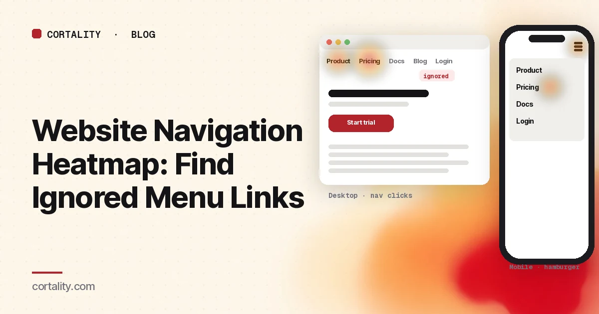
Your menu looks fine in the design file. On the live page, visitors still can't find Pricing, open the wrong section, or ignore half the top bar. A website navigation heatmap turns that guess into a picture: which links get clicks, which sit cold, and which soak up attention that should go to the offer.
This guide covers what nav clicks look like on a click map, the patterns that mean ignored vs over-clicked items, how the mobile hamburger changes the story, and what to change before you redesign the whole information architecture. When the words next to those links are also unclear, pair this with a landing page copy audit.
What a navigation heatmap actually shows
A navigation heatmap is usually a click or tap map filtered to the menu region, or read with the ranked element list next to the screenshot. Microsoft Clarity's click maps rank elements by click share and include taps on phones, so you can see whether "Pricing" or the logo is doing the work (Microsoft Clarity, Click maps).
It does not prove that people understood the labels. A hot link can mean the label is clear, or that visitors are hunting because the page itself doesn't answer them. A cold link can mean the item is useless, or that nobody notices it. Nielsen Norman Group's findability work separates those causes: click tests show which navigation components people use, avoid or miss in the UI, while tree tests and card sorts check whether the category names themselves make sense (NN/g, Low Findability and Discoverability).
Read the map with that split in mind. Our guide to reading a click map covers the general method; this post is the deep dive on menus.
What healthy nav clicks look like
On a marketing site homepage, expect most clicks to land on a short list: the main product or category links, Pricing or Plans, Login or Signup, and maybe one trust page. On a landing page, expect the opposite: most productive clicks should hit the call to action, not the nav. Heavy nav use on a paid landing page often means the hero didn't answer the question.
Useful checks:
- First clicks. Clarity and similar tools can show first clicks. If first clicks cluster on Search or a secondary item while the primary category sits cold, the top-level labels may be wrong.
- Share of all clicks. Note each menu item's percent of page clicks, not only the color. A warm Logo that reloads the same page can look "popular" without helping anyone.
- Device split. Desktop shows the full bar; phones hide it. Always open mobile and desktop heatmaps separately.
Example (illustrative): on a SaaS homepage, Pricing takes 18% of desktop clicks and 4% of mobile clicks, while the hamburger takes 22% of mobile taps. That points to a findability gap on phones, not a sudden loss of interest in price.
Ignored items vs over-clicked items
Cold links that should be hot
A Pricing, Features or Docs link with near-zero clicks, while support chat and search are busy, usually means one of three things:
- Nobody notices it. Placement, contrast or crowding hide it (a UI problem).
- The label doesn't match how buyers think. "Solutions" or "Platform" when people look for "Integrations" (an IA / naming problem).
- The page already answered the need. Less common, but possible when the hero covers price and product.
Don't delete a cold link until you've checked recordings and a quick label test. NN/g's method pair is useful here: if a tree test finds the name easily but the click test misses the link in the layout, invest in layout, not a full IA rewrite (NN/g).
Hot links that shouldn't be
On a landing page, "About", "Blog" or a logo that reloads home can dominate the click map. Visitors are looking for reassurance or an exit. Either answer that need next to the offer (proof, a one-line "what happens next"), or accept that those links will steal conversions. Our guide to elements visitors ignore covers the reverse pattern: important content that looks like an ad and gets skipped.
Equal heat across eight top-level items
When every top-level item gets a similar share, the menu is usually too broad. Visitors scan and guess. Cut, group or nest until a few clear destinations stand out.
The mobile hamburger changes the map
On phones the top-level links collapse into an icon. The heatmap then shows taps on the icon, taps inside the open drawer, and almost nothing on the desktop bar positions.
Patterns that matter:
- Heavy hamburger, cold CTA. Phone visitors are hunting. Put pricing, delivery or the next-step promise on the first screen so they don't need the menu.
- Hamburger open, then exit. Recordings often show people opening the menu, scanning, and leaving. Labels or order are wrong.
- Taps on items that open new tabs or long pages. A long homepage already costs swipes; sending people into another deep page makes it worse. See how long a homepage should be on mobile.
Baymard's ecommerce research also flags orientation: when the current section isn't highlighted in the main navigation, people struggle to tell where they are and where to go next. Their benchmark found 66% of sites don't highlight the user's current scope (Baymard, Highlight the User's Current Scope). On a multi-page marketing site, that same gap shows up as repeated menu opens and back-button use.
Labels people misread
Common failure modes:
- Internal jargon. "Ecosystem", "Workspace", "Intelligence" when buyers search for the job ("Invoice reminders", "Store heatmaps").
- Overlapping names. "Products" next to "Solutions" next to "Platform".
- Cute labels. Clever names that don't say what the page contains.
- Same word twice. Two "Resources" or "Learn" entries force a coin flip.
Fix with the buyer's words from sales calls, search queries and support tickets. Then re-check the navigation heatmap: the right label usually moves clicks without a redesign.
Too many top-level items
Seven or more peer links in the top bar push people into hunting. Prefer:
- Three to five strong top-level destinations
- One clear primary action (Signup / Get demo) styled as a button, not another text link
- Secondary items in a footer or account menu
On landing pages fed by ads, consider a reduced nav (logo + one trust link + login) and measure whether more people reach the CTA.
What to change (in order)
- Write down the pattern. Which items are hot, cold or only hot on one device.
- Watch five to ten recordings of people who used the menu and left without converting, and of people who never opened it.
- Fix labels before layout. Renaming is cheap and often enough.
- Then fix placement and count. Move the important link where the eye already goes; cut or nest the rest.
- On mobile, reduce the need for the hamburger. Answer the hunt on the page.
- Re-measure the same date-range length after the change. One change at a time.
Example hypothesis (illustrative): "On mobile, 28% of taps hit the hamburger and under 5% hit Pricing in the drawer. Rename Solutions to Pricing and surface a price line in the hero. Compare mobile Pricing taps and signup starts over two equal weeks."
Where Cortality fits
Navigation problems show up as elements people never reach, or reach and ignore. Cortality measures how real visitors use every part of your page, including what they see, skip, tap and stop at, on each device. You get a ranked list of fixes, each with the evidence and the exact change to make, and after you ship a fix Cortality re-measures it and tells you whether it worked. It works alongside Google Analytics and Microsoft Clarity rather than replacing them. See how it works or what a finding looks like.
For a quick first look, our free page leak scan takes about a minute and needs no install. It's a prediction from our attention model, not data from your real visitors, so use it to decide where to look first.
Plans are $99, $249 or $499 a month (Starter, Growth and Scale). Start your free week, and you see your first report before you pay. You save a card at signup, and nothing is charged until 3 days after your first report. Cancel before then and you pay nothing, and any charge can be refunded within 14 days. How the free week works.
Questions
What is a website navigation heatmap?
It is a click or tap map focused on your menu: the top bar, the mobile hamburger, footer links and other nav components. It shows which links get used, which are ignored, and which attract clicks even when they shouldn't on a landing page.
How do I know if visitors are using my nav menu?
Open the click map for the page, filter by device, and look at the share of clicks on each menu item. Compare that with where people go next in analytics. A cold Pricing link next to heavy search or support clicks usually means the label or placement is wrong, not that nobody needs pricing.
Why is my mobile hamburger getting so many taps?
On phones the main links hide behind an icon. Heavy taps on that icon often mean visitors are hunting for something the first screen doesn't show: pricing, delivery, login or what happens after signup. Bring that answer onto the page, then re-check the menu.
Should a landing page have a full navigation menu?
Often a lighter nav converts better, because every extra link is a way to leave. Keep what people need to trust the offer, hide or drop the rest, and measure whether clicks leave the page before the main call to action.