How to Audit Landing Page Copy: Headline, Subhead, and CTA Text
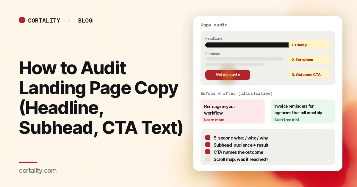
Layout problems get the redesigns. Copy problems get overlooked until ads feel "expensive." A landing page copy audit is the faster pass: check whether the headline, subhead and CTA text make the offer obvious to a stranger, then change the weakest line before you touch colors or sections.
This guide walks through a five-second clarity check, what the subhead and button must do, how scroll and attention maps show which copy gets read, friction words to cut, and before/after examples labeled as illustrative. If visitors can find the menu but still don't convert, also check your website navigation heatmap.
What a copy audit covers (and what it doesn't)
Covers: the words above the fold, section headings, proof lines next to the ask, form field labels and the primary button text.
Doesn't cover: page speed, tracking bugs, wrong traffic or a weak offer. Those fail even with perfect sentences. Rule them out first with our why a landing page isn't converting checklist, then come back here for the wording.
1. The five-second clarity check
Jakob Nielsen's summary of dwell-time research is blunt: to earn minutes of attention, you must communicate the value proposition within about 10 seconds (NN/g, How Long Do Users Stay on Web Pages?). A practical way to test that first glance is a five-second test: show the hero, hide it, ask three questions.
- What does this company sell?
- Who is it for?
- Why would someone choose it over what they use today?
Run it with five to ten people who match the buyer and don't already know you. Score each answer roughly right, partial or wrong. Rewrite whatever most people missed, in the order what → who → why, then test again with new people.
Nielsen Norman Group's homepage principles push the same idea in design terms: communicate who you are and what you do at a glance, with a tagline that states the offer in plain language, not a cheerful welcome (NN/g, Homepage Design: 5 Fundamental Principles). Landing pages need that clarity even more, because the visitor arrived with one job and little patience.
Headline checklist
- Names the offer in the buyer's words
- Names or clearly implies the customer
- Would look wrong pasted onto a competitor's page (specific, not generic)
- Matches the ad, email or search query that sent the click
Our guide to what to put above the fold covers the rest of that first screen.
2. The subhead answers for whom and what result
If the headline names the product, the subhead should finish the thought: who it's for and what result they get. If the headline already names the audience, the subhead can carry the mechanism or the proof.
Keep it to one or two short sentences. On a phone, a three-line subhead can push the button below the fold on its own.
Weak (illustrative): "A smarter way to grow." Stronger (illustrative): "Weekly creative tests for Shopify brands spending $5k+/month on Meta ads."
3. CTA text says the outcome
Button labels are copy, not chrome. "Submit" and "Learn more" describe the click, not the result. Prefer:
- Get my quote
- Start free trial
- Book a 15-minute demo
- Download the checklist
- See pricing
Only promise what the next screen actually does. If a card is required, say so near the button; a surprise after the click creates doubt that good placement can't fix. For where the button should sit, see CTA button placement.
4. Use scroll and attention maps to see which copy gets read
Words below where most visitors stop might as well not exist. Read the scroll map first: note the share of visitors who reach each copy block on desktop and on mobile. Then use an attention or area map, or time-on-section if you have it, to see which blocks stay on screen long enough to be skimmed.
Patterns:
- Hero copy reached, CTA cold. The words may be unclear, or the button label is weak. Fix copy and label before moving the button.
- Proof or pricing copy never reached. Move a shorter version up, or repeat the key line near the ask.
- Long paragraph with no engagement. Break it into a subhead, bullets and one proof line.
A copy audit without reach data rewrites paragraphs nobody sees. Pair the wording pass with the same evidence you use in a website UX audit checklist.
5. Copy friction words
Cut or rewrite lines that add effort or doubt without adding information:
- Vague power words: revolutionary, seamless, next-generation, end-to-end (unless you immediately define them)
- Internal jargon the buyer doesn't use on sales calls
- Hedge stacks: "may help you potentially unlock" → say what it does
- Equal CTAs: two primary buttons with different offers in the same style
- Surprise costs: "Talk to sales" when the ad said self-serve; "Enter card" with no warning
Replace with concrete nouns, numbers you can defend, and the buyer's verbs.
Before / after examples (illustrative)
These are made-up lines for the method, not results from a live test.
| Spot | Before (illustrative) | After (illustrative) |
|---|---|---|
| Headline | Reimagine your workflow | Invoice reminders for agencies that bill monthly |
| Subhead | We help teams do more with less | See unpaid invoices and nudge clients in one list |
| CTA | Learn more | Start free trial |
| Proof line | Trusted by innovators | Used by 400+ boutique agencies (example figure) |
After you ship a change, compare equal periods: conversion rate, CTA clicks and, if you run a new five-second test, the share of correct "what / who / why" answers.
A one-hour audit order
- Screenshot the first screen on desktop and on a real phone width.
- Run a five-second test with a handful of strangers.
- List every primary and secondary CTA label on the page.
- Read the scroll map for reach of headline, proof and pricing copy.
- Mark friction words and claims without proof next to them.
- Rewrite at most three lines: headline, subhead, primary CTA.
- Ship, date the change, re-measure.
Where Cortality fits
Copy problems show up as elements people never reach, or reach and ignore. Cortality measures how real visitors use every part of your page, including what they see, skip, tap and stop at, on each device. You get a ranked list of fixes, each with the evidence and the exact change to make, and after you ship a fix Cortality re-measures it and tells you whether it worked. It works alongside Google Analytics and Microsoft Clarity rather than replacing them. See how it works or what a finding looks like.
For a quick first look, our free page leak scan takes about a minute and needs no install. It's a prediction from our attention model, not data from your real visitors, so use it to decide where to look first.
Plans are $99, $249 or $499 a month (Starter, Growth and Scale). Start your free week, and you see your first report before you pay. You save a card at signup, and nothing is charged until 3 days after your first report. Cancel before then and you pay nothing, and any charge can be refunded within 14 days. How the free week works.
Questions
What is a landing page copy audit?
A structured review of the words that sell: headline, subhead, body claims, proof lines and CTA button text. You check whether a stranger can say what you offer, who it is for and what happens next, then fix the weakest line before you redesign the layout.
How do I test a landing page headline?
Show the first screen to people who match your buyer but don't know you, hide it after about five seconds, and ask what the company sells, who it is for and why someone would choose it. If most answers miss the point, rewrite for specificity and test again with new people.
What should CTA button text say?
The outcome of the click in the visitor's words: Get my quote, Start free trial, Book a 15-minute demo. Avoid Submit, Learn more or Click here. Only promise what is actually true on the next screen.
Can heatmaps tell me if my copy is bad?
They show what gets reached and clicked, not whether the words made sense. Use scroll and attention maps to see which blocks are on screen long enough to be read, then use a five-second test and recordings to check comprehension. Combine both.